If black and whites are your regular colours, stop and read this. It’s time to look beyond the grayscale range, and seek more colourful pastures!
It’s extremely easy to fall into the cycle of wearing black-on-white, or white-on-black. This easy colour combination means that you can effortlessly mix-and-match different tops and bottoms to create different outfits, albeit similar looking. In the work arena, a grayscale and less in-your-face colour palette is also more acceptable than fuchsia or neons. If you are more reserved in your colour selection, or afraid that you cannot match colours correctly, here’s how you can venture out of this monochromatic zone!
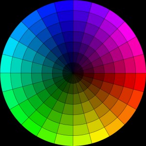
Colour wheel

Colour Wheel
Most people recognise the colour wheel in one form or another. A tool introduced during art classes, it has served many people well, helping them to recognise various colour combinations.
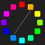
Complementary Colour combination
 These are colours that are on opposite sides of the wheel. The term “complementary” may seem like a misnormer for some, as these colours are contrasting. For example, orange and blue, yellow and plum. Complementary colours are perfect when trying to create a striking outfit. The only problem is that it may be too loud for a normal day-to-day outfit. An alternative is to tone one of the colours down and pick a softer hue of it; instead of orange and royal blue, light blue can be used.
Analogous Colour combination
 These are colours that lie adjacent to each other. They are similar in tone and hue and are often pleasing to the eye. For e.g. red, orange and yellow, or various shades of green. When picking analogous colours for your outfit, two or three of such colours is sufficient. Having more than three will be too much for the eye.
Use analogous colours when trying to create a monochromatic look. To prevent the monochromatic look from being too “safe”, you can opt for a more striking hue for one of the colours while keeping the rest more muted.
Accent Colour combination
This combination thrives on having one strong and bright colour (aka accent colour) over analogous colours. The idea is for these accent colours to pop out. The desired effect is like wearing a statement piece of jewellery which add punch to your overall outfit. The accent colour should be used sparingly, possibly something small like a piece of accessory or jewellery.
Rules of thumb for matching colour groups
You may ask, what about colours like black, brown, and white? Where are they on the wheel? These neutral colours are not found on the wheel and are usually thought of as neutrals. These neutrals always work with other colours, including each other. Despite many sources advicing against neutral + neutral pairing, like white + cream, gray + brown, I personally find that these colour combinations create a neutral and minimalistic look that continues to work.
You may find this categorization of colors, in 4 colour groups useful:
- Neutral – black, white, gray
- Cold – blue, green, blue-purples
- Warm – red, orange, yellow, pink, pink-purples
- Warm neutrals – cream, beige, tan, brown

You can use them in the following combinations that will always work:
- 2 colours + 1 neutral: the colours can either be complementary or analogous
- 1 colour + 1 or 2 neutrals: e.g. purple, black and grey
- 1 pattern + 1 neutral + 1 colour (from within the pattern)
xoxo,
Jacey
Credits: Robson# (flickr), colorsontheweb
Comments
There are no comments on this entry.